
Previously, Google forced everyone to have a Google Plus profile. I am not sure what made Google think that enforcing its social network platform to everyone is a good idea. This decision left users angry and Google finally realised it was wrong. The requirement of having a Google+ profile was dropped in late July. After some time, Google left Google+ alone by ripping off its best services like Google Photos from it. This made users believe that Google is killing Google Plus but that wan’t the case. In this article, I aim to provide a review of the new Google Plus on desktop.
New Google Plus: The Interface
The overall interface old Google Plus was, well, old. It was never considered as modern social network interface by anyone I know, but I had some liking towards it. It was easy and did my things. Older interface used to show a user’s stream in uneven way. At many times, there used to be a blank space between user’s posts due to the way Google Plus organized them.
The interface of new Google Plus isn’t that new but it organizes posts better and does not leave blank space between them. It feels good to see those posts nicely managed into blocks. This round, Google you win it.
Is is all about users’ interests?
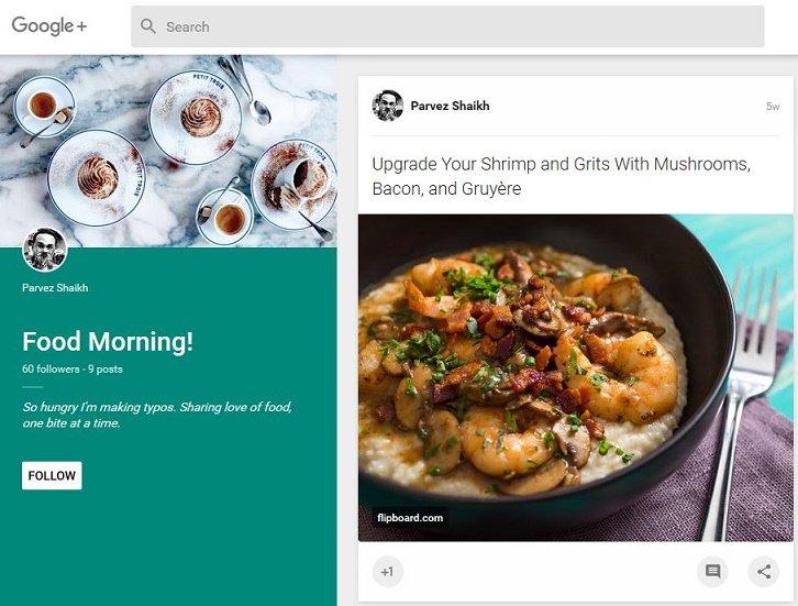
If you visit my profile, all you will come to know about me is my name, the number of followers I have and my designation. That’s it. After that there goes the ‘interests’ frenzy. The new Google Plus pays just too much attention to users’ interests rather than the user him/her self. And if you want to know more about me, you will have to spot a little ‘About’ icon on far right. Google could make this simpler.
Upon clicking that tiny ‘About’ icon, you will see more about me. The about section has more importance on ‘Links’ rather than about the person. First you’ll see people in common, then links and then you can see more about me. But anyway, Google has made it easier to find a user’s social profile and website URLs.

So, the first thing you will see on a user’s profile is his/her interests. The collection created by that user and communities the user is following gets supreme importance in new Google Plus. It makes me think why Google decided to focus on interests rather than the user? Eddie Kessler, Director of Streams with Google, has the answer – “There were two features users kept coming back to: Communities and Collections.” According to Google, communities are seeing 1.2 million joins per day (seriously?) and collections are growing even faster. And this is exactly what made Google Plus “focused around interests”.
When you are done with my ‘interests’ and you have any interest left in rest of my profile, you can continue to my actual updates.
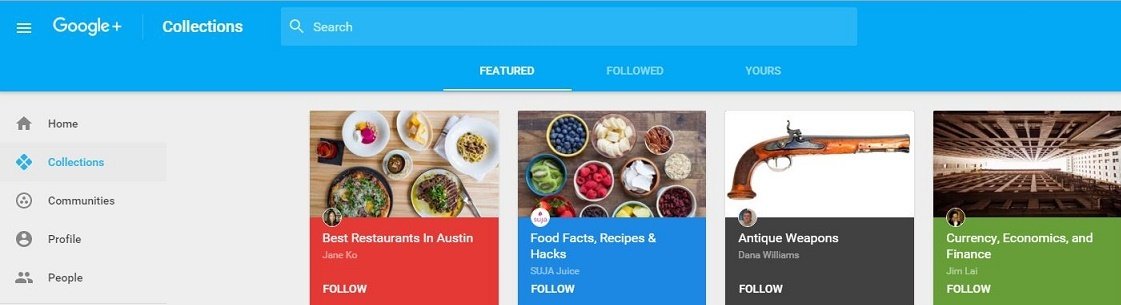
Collections and Communities: Redesigned and Featured
Collections and communities, two of the most important things in social media according to Google, are now redesigned. Previously, a collection had some weird looking header where the picture would not fit properly. No matter which image I chose, it would never go with the color and layout around it. I have to admit that new Collections are better looking. The image and details go on left instead of top and it does fit properly. Communities are designed in similar way as well.
While I like the new look of Collections and Communities, what I dislike is the ‘featured’ part of it. When you want to go to the list of communities or collections you’re following, Google Plus will present you a nice list of ‘featured’ communities and collections. No matter if you’re interested in a topic or not, you will have to go through the list of it. For example, Sports (and I’ve never been a sports person in my life) or Best Restaurants is Austin (I’ve never been near Austin!)
Waste of Space, Again
I remember Google Plus used to have too much of blank space on right side of the screen at one point of time in past. That space disappeared eventually but new Google Plus has brought back waste of space. The left side of Google Plus profile have some weird, unnecessary amount of space, and I’m not okay with it. When you visit a collection or community, you won’t feel the space being wasted though. So basically Google may add something on the user profile’s wasted space too.
Hover Cards and Profile Views Are Gone
Google has decided to remove hover cards and profile views. You can no longer hover on someone’s profile picture/name and see a quick snapshot of the user’s profile. One thing I really enjoyed previously was profile views. It gave me an idea how many times my profile and its content had been viewed. Many users even asked Google to add an option to see who viewed their profile. That option never made its way on Google Plus and the profile views are gone too.
Damn, I was this close to one million views of my profile! (May be I already crossed one million, didn’t notice before switching to new Google Plus.)
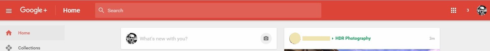
Spot my notifications
The notification badge used to be red, and it sill is. The only problem is the color of Google Plus header which is also red. I guess Google will allow users to change colors, and I’m never going to keep it red, that’s for sure.
Can you spot my notifications?
Sharing something is a headache now
Sharing something new on Google Plus never used to be easy anyway. Previously, you would type in or paste some text/link and select users/community you want to share it with. Typing name of the community, and selecting a sub topic of that community was hell of a job. With new update, Google has decided to change it, making it even worse.
When you click on What’s new with you? area, the last community along with its sub topic you shared your previous update to, will be selected automatically. As if I’m going to share everything with the same community and in same topic forever. That’s not it, selecting a new community or user is even more hectic. You click on the community that is selected, and it will present more recent communities or users. Heck! So again, you click on See more and select the community or users you want to share your post with. Easier? No way!
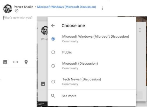
One thing Google has still not added is the ability to share something with multiple communities at the same time. Why can’t you just select more than one community and their sub topics and share it? When I want to share something on different communities, I will have to go through the same hectic process mentioned above. And when you’ll visit my profile, you will see a single topic multiple times because I shared it multiple times!

Annoying progress bar on top
Call me nuts but the blue progress bar (or whatever it is called) on top of Google Plus screen is just too annoying for me. When you click on something, like a user’s profile, that blue progress bar will appear and will keep going and coming back so quickly that it makes me feel hypnotised. No, seriously it just flashes too much and too quickly.

The Bottom Line
After typing about 1300 words, I wish to stop this review here. I am not sure whether Google has plans for improving and continuing Google Plus as a social media platform but if it does, this is not the best Google Plus Google can stick with. Google Plus has always been a platform to meet people with similar interests and so far I’ve enjoyed Google Plus no matter how annoying it could be to do different tasks.
If you have tried the ‘all new Google Plus’ share your experience with me.
If you found this article interesting, share it with others. And by the way, you can follow me on Google Plus!
Tip: If you were too excited to try the new Google+ and are not enjoying it, there’s a link to switch back to “Classic” Google+ in bottom left area of the screen.
Until we meet next.
Support Me: If this article/tutorial helped you today, please consider supporting me and help me run frunction.com